


PINOLE — A Native American man standing cross armed and backed by scenic hills has been on Pinole’s city seal and logo since the early 1960s, but that “outdated” design will now be retired in favor of one crafted over the past year.
Work to develop new city branding began in early 2023, with officials consulting Corrina Gould, the tribal chair of the Confederated Villages of Lisjan, who advised against using a Native person in the update designs. That design also received pushback from people who argued the man was an inaccurate representation of Native people.
“My support for this initiative was not to change history but to really reconcile history,” Councilmember Devin T. Murphy said during Tuesday’s council meeting.
The City Seal Ad Hoc Subcommittee was formed in March and community engagement commenced. While some community members argued in favor of keeping the previous logo — asserting it highlighted the city’s indigenous history, according to survey results — others suggested oak trees, corn, rolling hills, the San Pablo Bay and other natural features and landmarks could better represent the city.
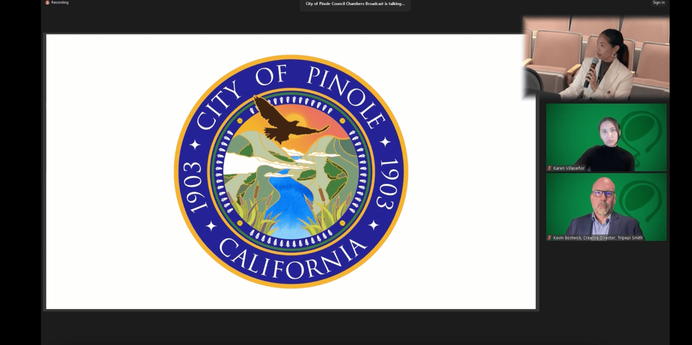
Officials present a new city logo to the Pinole City Council on Tuesday, March 19, 2024. This seal/logo was unanimously approved. (Photo Courtesy of city of Pinole)
The final design, unanimously adopted by the council Tuesday night, features a hawk soaring into the Pinole Valley with green hills draped in fog and split by a flowing creek, creating a “calming, yet commanding presence,” said Fiona Epps, assistant to the city manager. Surrounding the nature scene is a blue and yellow border with the city’s name, year of establishment and California written in white and a ring of acorns.
Each element was meant to represent different aspects of the city’s image — acorns for legacy and history, the hawk for vision and stewardship, cattails for peace and prosperity, flowers for beauty and balance, and the fog to highlight the city as part of the larger Bay Area.
Councilmembers lauded the final product with Councilmember Anthony Tave saying the designs look “presidential,” while Murphy said he was nearly brought to tears. Councilmember Norma Martinez-Rubin, who served on the subcommittee with Mayor Pro Tem Cameron Sasai, said the work was often fun.
“We were pleased, very pleased with what is being presented here,” Martinez-Rubin said, sharing appreciation for Epps and others who led the effort.
Implementation of the new branding will take time. Another vote will need to be held before the seal is officially added to municipal code and some projects, like removing large seals and mosaics of the last design from city buildings will be costly. Councilmembers stressed the importance of preserving some of those pieces as historic artwork.
Epps said staff will return in June with project cost estimates as part of the budget process. Other changes — purchasing new flags, badges and stationary — will require less time to implement and will largely be covered by department budgets.
“I do have a sense of relief that we’ve come to a decision,” Epps said after being asked about the most challenging aspect of the rebranding project. “It was a long time coming but it was very worth it.”


+ There are no comments
Add yours